

Only What's Needed
Graduation Project done as part of internship with Studio Sorted,
under the guidance of Abhishek Durani and Netra Ajjampur.
YEAR
2025
CLIENT
Food Pharmer
Only What’s Needed is not just an FMCG brand—it’s a movement born out of clarity, intent, and participation. This project set out to redefine what it means to be a clean label food brand in India.
SCOPE
Brand Strategy
User Research
Verbal Identity
Visual Identity
Packaging
Digital Media guide


Project Brief
Revant Himatsingka aka Food Pharmer, partnered with Studio Sorted to launch a clean food brand that sets new industry benchmarks in purity and transparency while placing education at its core.
The brand aims to empower consumers with knowledge to make informed health choices, foster trust and community ownership through co-creation, and stand out in a competitive market with a distinct brand voice and packaging system that communicates its values clearly.

Brand Pillars
01
Product Truth
Brutally honest
& militant clean
food products.
02
Functional Benefit
Knowledge &
access to clean
food choices
03
Emotional Benefit
Sense of control
and confidence
04
Brand Purpose
Make India
Healthy & Aware
Essentially,
Education is our core.
Co-creation is our differentiator.
Militant Clean is our non-negotiable.

Brand Archetype

Logo Ideation
We aimed for a logo that truly
embodied the concept of
“Only what’s needed”—something so
simple that it would not only resonate
with Food Pharmer’s audience but also
be easily understood.
Various iterations were explored, experimenting with the hierarchy of words, emphasis, and incorporating symbols within the text itself.
The process evolved as the team
prioritized packaging first.
The logo needed to seamlessly integrate with the packaging design while also being versatile enough to work on a larger scale.

.png)

Logo Concept
On a brand level, it acts as a movement driver,
laying the foundation for a healthier India, one block at a time.
On a product level, this product is crafted with only what’s needed—nothing more, nothing less—exactly what’s required to help make India healthy again. It’s the missing piece of nutrition that has been lacking in your life, especially as we begin with a supplement product.


Primary palette
Secondary palette
Color
Application

Typography
Illustration Style


Social Media


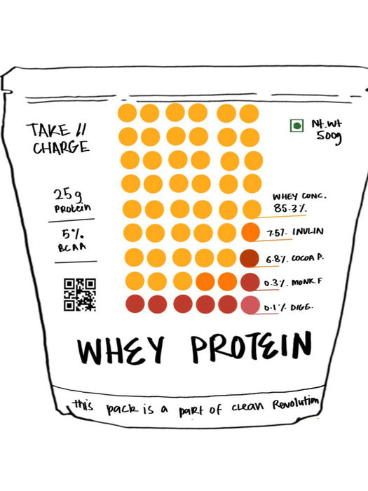
Packaging is our HERO.

What makes OWN different?
The back of the pack comes to the front.
Sketching down ideas
>>
A customised Nutrition Table
[Only what's needed's primary asset]

Start
-08%202.png)
Middle

Current


3
TERTIARY

2
SECONDARY

1
PRIMARY
Information hierarchy


Brand Guidelines
This document is a comprehensive resource for defining & implementing the
ONLY WHAT’S NEEDED brand.
It provides precise tools & frameworks to ensure every interaction reflects our identity. Each component is purposefully designed to maintain cohesion and deliver a unified experience across all platforms and audiences.
The launch
By blending co-creation with a clear design direction and commitment to the mission, we created one of the cleanest food packagings in India. Since launch, the overwhelming love and response from people has been nothing short of incredible.


Graduation Project with Studio Sorted
This project at Studio Sorted was part of my Graduation Project at the National Institute of Design.
It has been an incredible learning experience, built in collaboration with a wonderful team.
I had the privilege of documenting the entire process from the very beginning, and you can explore the detailed journey in the document here.

Project completed under the guidance and support of
Follow @studiosorted on instagram, and visit www.studiosorted.com for more work from the studio.
Creative direction: Abhishek Durani
Brand Strategy: Abhishek Durani, Vrinda Gupta, Kashish Choudhary, Shreya Agarwal, Anshul Gupta
Graphic design: Shreya Agarwal, Anshul Gupta, Vrinda Gupta
Copywriting: Kashish Choudhary
Animation: Rizul Tomar


